“Material Design” – that’s what Google is calling its new look for Android.
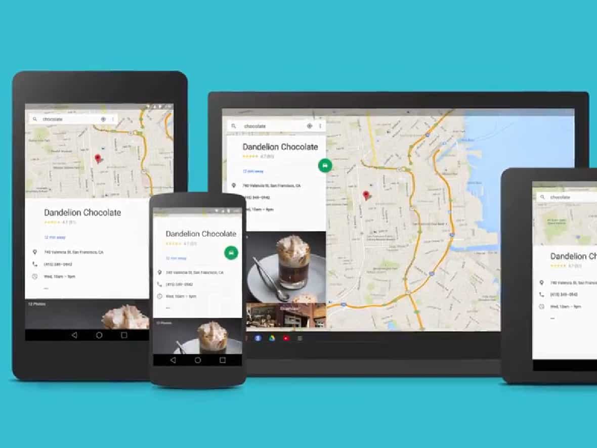
We got a sneak peek of the future visual design of Android at Google I/O here in San Francisco. Overall it’s consistent with what we’re seeing in the market when it comes to UI refreshes (most recently with Microsoft’s Windows 8 and Apple’s iOS 7). That means flat, simple. With lots of white space. Also, Google appears to be extending its card-based metaphor that we’ve seen first on Google Now, and, recently, on results on the Google search page.
Fonts have been given a makeover as well – I like what I’m seeing so far, everything is legible, modern and pleasing to the eye.
One thing that immediately caught my eye with the new Android look and feel are the three nav buttons.

No question, many are going to wonder, what on earth happened?! In place of the iconic–and very literal–back, home and recent buttons are three simplistic replacements: a triangle, circle and square. Very basic. In fact they are so simplistic, it almost feels as if they’re placeholders (or a cruel joke some might think) for what would surely will be the real icons. But, wouldn’t you know it, after spending a few minutes looking at them, and comparing them to the ones on my Nexus 5, I have to say it’s clean, and works. Quite interesting how design language these days is headed down the path of simplicity. Remember Aero and Windows 7? Drop shadows, transparency, gradients. Ah, the good old days.
Google’s “Material Design” for Android
Clunky wearables?
Pay close attention at Google I/O and you’ll notice something.
On every presenter’s wrist…
…is something that looks like a GPS tracker, or early LCD watch from the 80s.
That is, in fact, the upcoming LG G Watch.
Google made a big deal out of Android Wear earlier this year in a preview designed to get developers on board. The new wearable platform, based on Android, is expected to power at least two major smartwatches this summer. In addition to the G Watch, Motorola is going to release its Moto 360. Based on what I’m seeing at I/O I hope it’s far better looking compared to these clunky things the Google team are wearing.