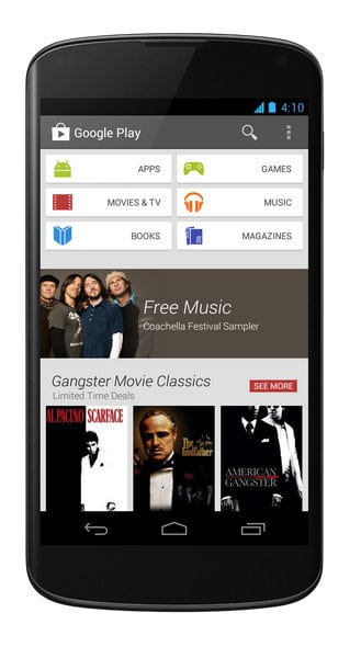
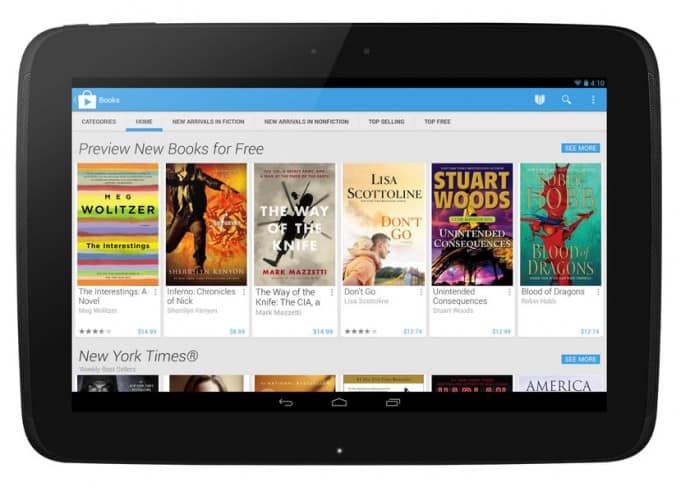
Google’s card-based design metaphor that we first saw with Google Now, and then with certain Google search results (weather, stock price, sports, etc.), has now founds its way to the Play Store.
Per the official Android blog, the refreshed look is rolling out today. In the words of Google the new look “is simple, clean” and allows users to “find great entertainment, fast.”
Those running Froyo (Android 2.2) or above should see the update land sometime today. Others around the world can expect the update in the coming weeks.
Google’s app store has come a long way since 2009. I remember the days when it was a rough and tumble place – I wrote then that it was like “walking through a bad neighborhood.” That’s no longer the case. Not only has Android caught up to iOS in terms of the number of quality, brand-name apps, the presentation of the content–movies, magazines, books, apps, music–is every bit as good as what you’ll find in iTunes. In fact, I prefer Google’s clean, image-centric design approach. Also, Google Play is fast.

I’m in the Baja for a working vacation so it’ll be interesting to see if my Nexus 4 (unlocked, T-Mobile) is recognized as a domestic device, or if the Mexican IP will mean I’ll have to wait to next week when I return to Silicon Valley to see the update.
ALSO: I’m betting on Motorola X-Phone over Nexus 5
Meantime I recently installed the Nova Launcher (Prime) and am floored by how well it adds to the functionality of stock Android without interfering with its core attributes-speed, uncluttered UI, depth of customization.
Now that Google Play has been given a fresh coat of paint, and Google Now updates continue to roll out, the kettle drums are getting a little bit louder… Key Lime Pie awaits in the wings.


