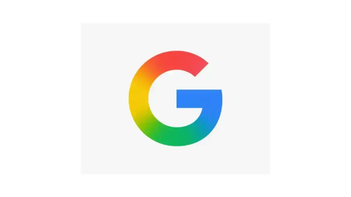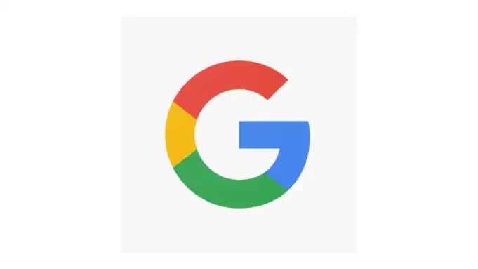
On May 12, 2025, Google unveiled a subtle yet significant update to its iconic “G” logo for apps, marking the first major redesign since 2015. The new design transitions from the traditional solid red, yellow, green, and blue segments to a smoother gradient blend of the same colors. This visual update reflects a more modern and dynamic aesthetic in alignment with Google’s increasing focus on artificial intelligence (AI) technologies and innovation.
Design Evolution: From Flat to Fluid
The 2025 redesign replaces these solid segments with a seamless gradient, creating a more cohesive and fluid appearance. This change aligns with the design language seen in Google’s AI initiatives, such as the Gemini logo, which utilizes blended gradients shifting from blue to purple, red, and pink.
The Gradient Trend in Modern Design
Gradients have experienced a resurgence in recent years, becoming a dominant trend in graphic design. They offer depth, dynamism, and a modern aesthetic that flat designs often lack. In 2025, gradients are being used innovatively, often referred to as ‘aurora’ designs, integrating elements like grainy layers and blurs for a dreamy aesthetic.
Recent Design Updates Featuring Gradient Elements
Instagram – 2016
Mozilla Firefox – 2019
Asana – 2019
Peacock (NBC streaming service) – 2020
Adobe Creative Cloud – 2020
Microsoft Edge – 2020
Grammarly – 2022
Spotify (limited UI icon use) – 2023
Google (Gemini AI branding) – 2024
Google “G” logo – 2025
Google’s adoption of a gradient logo reflects this broader trend, signaling a shift towards more vibrant and engaging visual identities. This move may influence other brands to explore gradient designs, especially as they seek to convey innovation and adaptability in a rapidly evolving digital landscape.
Aligning with AI and Future Technologies
The new gradient “G” logo is more than a design update; it’s a visual representation of Google’s commitment to AI and future technologies. The smooth color transitions symbolize the seamless integration of AI into Google’s products and services. This design choice aligns with the company’s broader strategy to position itself at the forefront of AI innovation.
Rollout and User Reception
The updated logo has begun appearing in the Google app on iOS and Pixel devices, with plans for a broader rollout across other platforms.
While the change is subtle, it has sparked discussions among users and designers alike.
Some appreciate the modern aesthetic, while others view it as a minor tweak. Regardless, the redesign reflects Google’s ongoing efforts to evolve its brand identity in line with technological advancements.
Visual Comparison
To illustrate the change, here’s a comparison of the old and new “G” logos:
2015:
2025:
The update coincides with Google’s rollout of Material 3 Expressive — a new look for Android that updates just about everything, from typography and layout to color, text, animations and more.
Implications for Design Trends
Google’s shift to a gradient logo may set a precedent for other brands, especially in the tech industry. As companies strive to convey innovation and modernity, adopting gradient designs could become increasingly popular. This trend emphasizes the importance of adaptability and visual engagement in brand identities.
Final Thoughts
Google’s new gradient “G” logo represents a thoughtful evolution of its brand identity, aligning with contemporary design trends and the company’s focus on AI and future technologies. While the change is subtle, it signifies a broader shift towards more dynamic and integrated visual branding.
Overall, I like it. Nothing major obviously in this update, rather a subtle evolution and modernization. Icons and app logos that never change eventually go stale — like just about anything else in the world of design.
Things always to circle back around when it comes to design. So we get skinny jeans, regular jeans, flood jeans, and then back again to skinny jeans. Or we go from black Hi-Fi components to silver and back again years later. Hang on to something dated (like granite kitchen counters or a green fridge) long enough and it may just happen to come back in vogue again… maybe.

