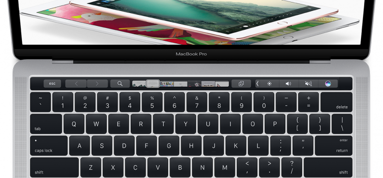
When Apple first released the Touch Bar on its 2016 MacBook line I was duly impressed. Indeed it made for a whiz-bang demo; the ultimate party trick.
Here was a dynamically changing range of buttons and controls that adjusted depending on what app you were running. You could customize the layout in true Apple fashion — meaning it was easy, intuitive and even fun.
But I’m a pretty basic guy.
I run Google Chrome. Spotify. Maybe the Calculator some days when I’m really feeling adventurous. And that’s about it.
Occasionally if I’m on the road — which is never these days — I will edit videos or at least parts of videos for Stark Insider using Premiere Pro.
There the idea of the Touch Bar did seem intriguing. Having shortcuts a short distance away from the keyboard sounds great in theory, and could potentially save time when editing (I’m already the world’s slowest video editor so not sure this even matters).
When the time came, however, I simply found myself using the standard Premiere shortcuts, ones that are essentially the same across Mac and Windows, where I do my main video editing on a Ryzen-based, 3-monitor setup which works amazingly well, especially given its total cost. Those keyboard shortcuts together with a mouse was all I needed to get the job done.
Years later, after using my MacBook Pro since December 2016 when I acquired it just before a trip to Paris and Iceland I now find myself assigning a pretty simple duty to the brainy Touch Bar: making it act like a normal (aka physical) row of function keys found on the previous gen Touch Bar-less MacBooks.
So instead of having a Touch Bar that dazzles all Starbucks onlookers, mine can do things like adjust screen brightness, volume, and keyboard brightness. There’s also a shortcut for taking a screen shot!
Every time I try to get fancy and re-visit my decision and try some new customizations… nope, I find myself changing it back to the tried and true MacBook function keys layout of circa 2015.
All that to say if Apple does kill the Touch Bar this year as it’s currently rumored to do then I won’t be one of the ones complaining. Who knows. Maybe not having that extra LED display will mean longer battery life.
That’s a trade-off well worth it.
Throw in the Apple grown M1/M2 chips and I think things are looking up for a smart 2021 MacBook refresh. Just in time for my upgrade cycle. And won’t it be nice to have an old school approach to adjusting speaker volume, not to mention a tactile ESC key?
Keep it simple. Keep it simple.
(oh: and thanks in advance for adding back an SD card slot… same as it ever was.)