Google is putting the finishing touches on its first major update to Android Wear, the smartwatch operating system that debuted over two years ago.
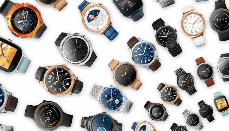
Wear 2.0 is expected to ship later this year, and, along with it, I’m expecting will see a bevy of new watches running it. There’s a lot of tweaking in the update. A lot of that has to do with the user interface and experience.
But is it really a major step forward? And, more importantly, will it be enough to bite into smartwatch market leader Apple, and fitness tracker leaders FitBit and Garmin?
Since the I/O conference and the Wear 2.0 preview, I’ve been sifting through the Wear developer site, reviewing docs, checking out preview images of the UI updates, and watching videos (and, of course the actual I/O Wear 2.0 presentation). I don’t have a Huawei Watch or LG Urbane LTE — the only two watches that can be flashed with Wear 2.0 — so I’ve not yet been able to actually test a live, running version of 2.0, but hope to soon. As an aside, Google does a fantastic job of documenting Wear design guidelines and principals. Definitely worth pursuing, even for non-developers such as myself.
Meanwhile, here are some initial (and very casual) impressions of the upcoming Wear 2.0 smartwatch OS.
First Impressions: Android Wear 2.0
Wear 2.0 is not a major update, think UI overhaul
With Wear 2.0, apps will be able to access the internet without a smartphone connection. There’s a (ridiculous, microscopic) keyboard for tapping out text responses, and automatic detection of fitness activities. Despite the 2.0 version jump, consider those incremental improvements.
It would seem most of Google’s efforts went into streamlining the user interface. Whether that’s will be a success with 2.0 time will tell. Based on the preview, though, I’m not yet convinced.
A vertical swiping metaphor replaces a combination of left/right swipes:

Instead, now you can swipe up to the top, for instance, to reveal a navigation drawer where you can navigate between app views, and you can also swipe to the bottom to see an action drawer. In the context of a messaging app, for example, you’d see a stream of, say, Hangout messages. Swipe to the top where you might compose a new message, or swipe across to other apps. Or, swipe to the bottom to take action on that particular message (Reply, Add photo, Share location, etc.). Seems decent enough.
But, that back button seems an odd design choice
For all the swiping and tapping we do on our Wear smartwatches, it seems odd, then, that Google would incorporate a physical back button in 2.0. My guess is Google is seeing how Apple incorporated a crown and button in its Watch design and feels compelled to offer something similar. The combination of swiping, and now the need to push the back button might be, really, a pain in practice.
Darker theme and app colors: a step in the right direction
One thing I love about Samsung’s Gear S2 — aside from its striking, contrast-rich AMOLED display — is that the Tizen OS favors a dark background. White text, and colorful icons are tremendously bright and punchy. And punchy is good, right? Especially on a tiny little screen on our wrist.
Wear 2.0 is heading a similar direction. Based on what I’m seeing with the preview, the white dominant look of Android Wear will be replaced by a darker theme, one that assigns a palette of colors based on the app in question. There are 20 dark color palettes available for Wear 2.0. Purple example:
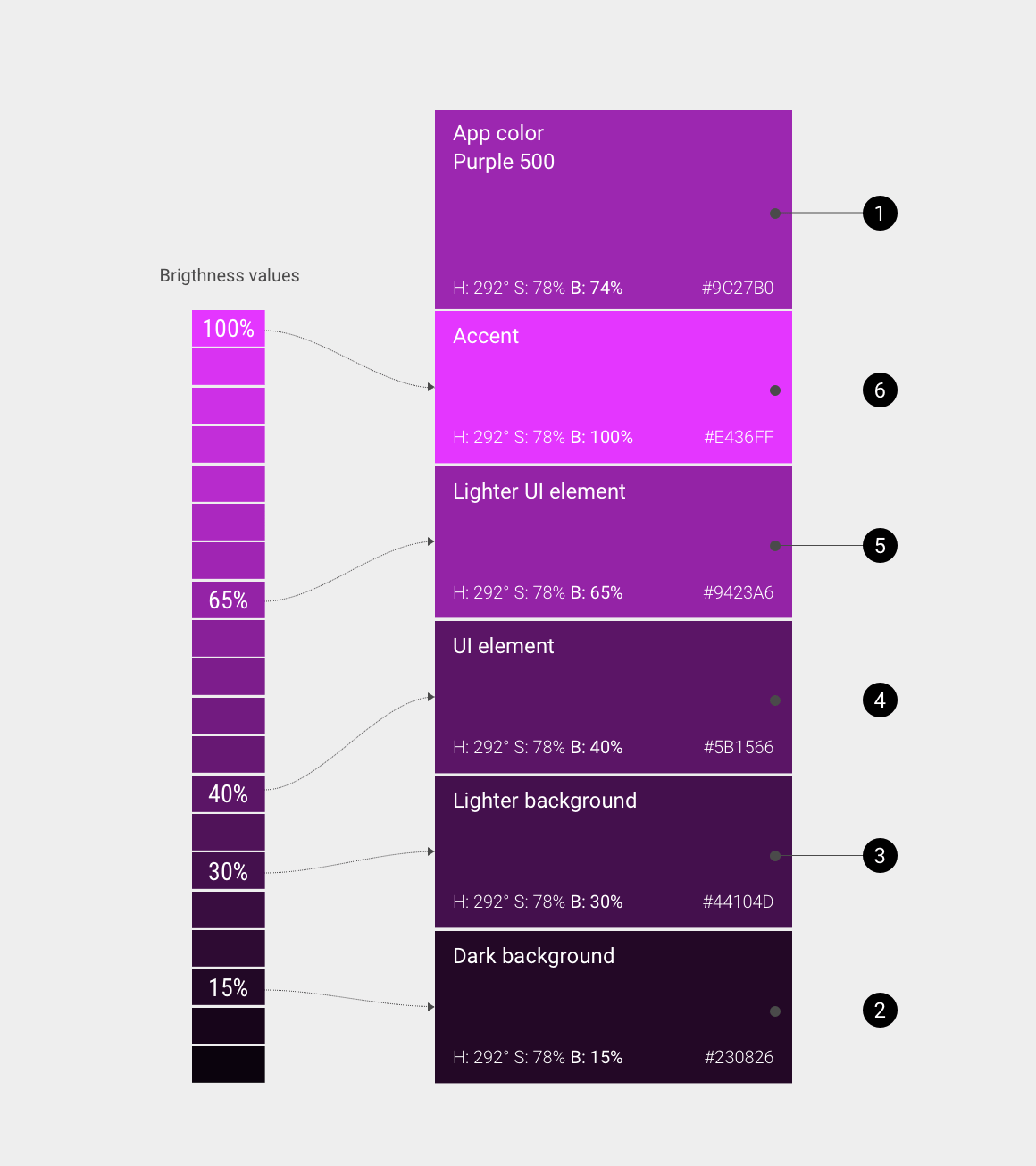
Hangouts, for example, would be green, Gmail, shades of red. And so on. The Wear 2.0 API takes care of the various shades, and has rainbows of sorts already defined depending on a given app’s primary color (74% brightness). What this means is instead of generic black text on a white background, you’ll now get (a more eye-pleasing in my estimation) white text on a darker app-specific background color.
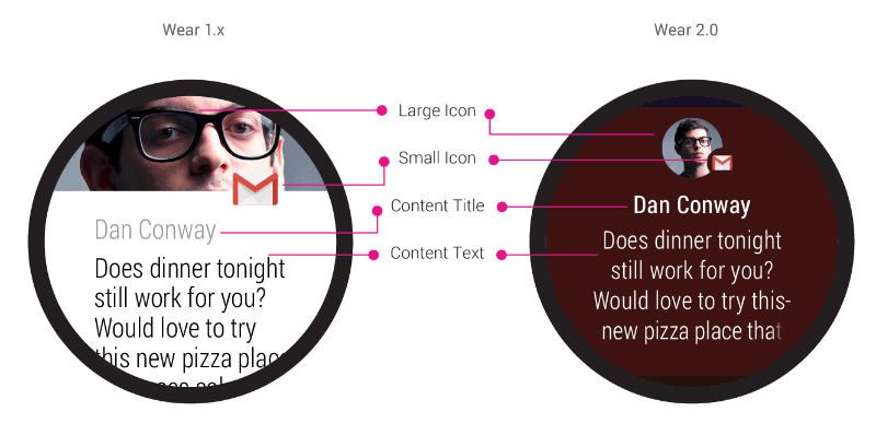
Here you can see Android Wear 1.x (left) with white design, and the updated 2.0 color scheme:
One additional benefit of this updated color scheme could very well be battery life. White typically requires the most power drawer. We will see if this turns out true — if so, it expect it to be very minor.
Complications API will enrich Wear watchfaces for the better
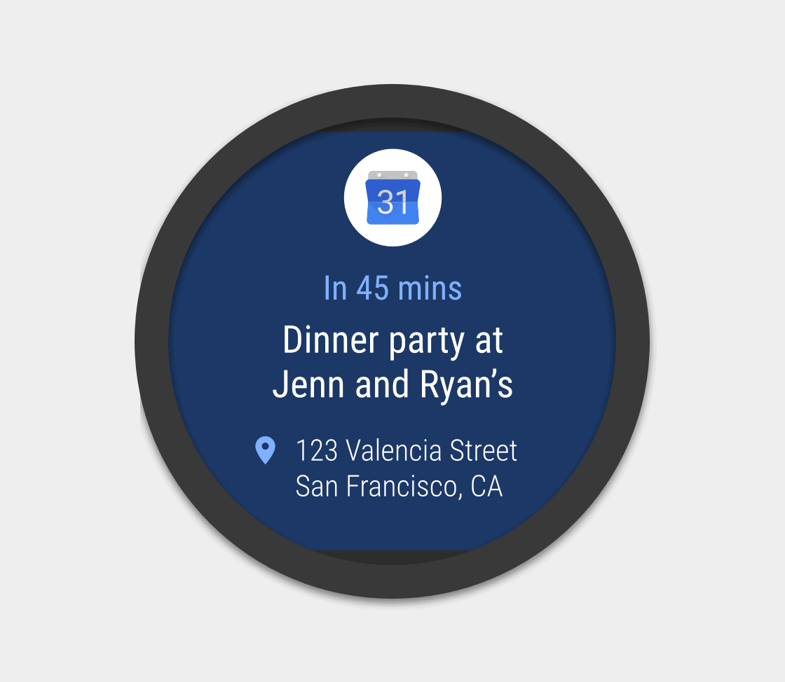
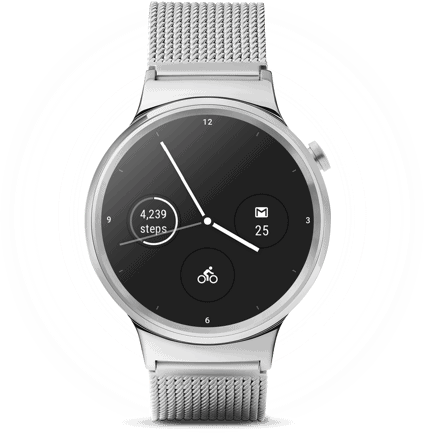
Us Wear users have long been able to load-up third party faces (Watchmaker is superb for that). I especially like the ones that incorporate all sorts of data right into the face itself — steps, weather, battery life, calendar, notifications. Very handy. Up until now, though, this required some heavy lifting on behalf of developers. With the Complications API, displaying extra info, and being able to customize its location and content, will be much easier.
Net-net: this is another step to counter what we’ve already seen with Apple and WatchOS: an easy way to customize watchfaces, making them more useful at a glance.
And that’s about it…
There’s not a whole lot more to talk about when it comes to Wear 2.0. To my eyes, it still feels very much firstgen.
Some things I think Google really needs to improve with 2.0 that I’ve yet to see:
- The Android Wear app itself — it’s unreliable at best.
- Do Not Disturb mode and Notifications control — it’s a pig’s breakfast, as my Dad might say. It was superb in prior Android versions: you could select All, Priority or None. With Marshmallow (and consequent Wear update) now all you can do is turn DND on or off. I’d prefer to see something like what Pebble offers. Pebble has a tab that lists all apps installed on your phone. There you simply select notifications on or off. Further, you can change weekday and weekend behaviors. So, maybe, you prefer not to get certain work email notifications on the weekend. Simple stuff. Google, instead, forces us to wade through settings screen after setting screen — both within the apps themselves and the overall Android settings screens. I’ve been using Android since 2009, and I still can’t figure this stuff out. I know this: when an icon appears on the notification bar of my Nexus 6 it always — always — comes through to Pebble, but may or may not do so with my Moto 360.
- Longer and more consistent battery life — yes, we always want more battery life. And, thankfully, with recent Android and Wear updates, we’re seeing watches that can easily last at least a day, maybe more. But then there’s consistency. I always know my Pebble Time Steel will go 4-5 days easily, sometimes more (depending on watch face). With my Moto 360 Sport sometimes I get 2 days even with always on screen enabled (not bad!), while other times it will, for whatever reason known only to Gary Busy, will tank, running out of battery in less than 10 hours. Unpredictable. And unreliable. Google’s standard MO: reset phone, clear cache, reset watch, repair, resync apps, etc. etc. Wonder why Wear hasn’t caught on with the mainstream buyer?
- All Hail Dick Tracy! Let’s scrap the idea of the smartwatch as a smartphone replacement — again, Pebble gets it right. Watches are a convenient extension of our phones, giving us useful information on the wrist, without having to pull out our phones. It’s a watch, first and foremost. Not a phone. Yet, I guess we just can’t rid ourselves of that Dick Tracy fantasy. So, with Wear we get a speaker (?), a ridiculous, microscopic keyboard (?), the ability to take/receive calls (?). Why, why, why?! I appreciate Google’s innovative ethos, by I thin the inmates (engineers) are running slightly amok with feature prioritization (see: Google on Wear 2.0: “We’re listening very closely to our developers” and that’s the problem with Wear)
- Focus on fitness — the market has spoken. FitBit and Garmin lead all wearable makers. It would seem the early killer app is fitness. Pebble seems to get this. It doubled down, introduced a new Health app, and platform for developers — plus, the upcoming secondgen Pebble watches will include heart-rate monitors. I wish Google would think the same way about Wear. My suspicion is fitness trackers and smartwatches are converging. Look at the new Samsung Gear Fit 2 (only $179!) — it’s a fitness tracker, yes, but it also performs nicely as a smartwatch, giving us notifications, weather, etc at a glance. If we’re going to wear a smart device on our wrists (or clip it somewhere) why not be a device that does it all: fitness, notifications, music control, hear rate monitoring, GPS, etc. From what I’ve seen in 2.0 so far, Google is not prioritizing fitness high enough in the feature chain. I believe the 4 smartwatch pillars should be: notifications, communication, information, fitness.
- In the words of John Travolta, This car could be
… syst-o-matic
…hydro-matic…
…ultro-matic…
And so could Android Wear. I’d suggest another: Auto-matic. Again, look at Pebble (and the new Gear Fit 2). Sleep tracking is automatic. Why isn’t it on Wear? Also, many wearables can automatically detect activities (running, biking). Why can’t Wear? Look, Wear does some things amazingly well. Google Now and Voice Search are far-and-away best in class. Exceptional. But if smartwatches are truly to be “smart” it would be nice if they indeed could do some heavy lifting for us, and, in this case, automatically detect and understand what we’re doing at any given moment. - Better display technology — this one is not really a Wear issue, but I’d if Google decided to build in support into the OS for high efficiency, hybrid-type displays we’d see more innovative alternatives to OLED and LCD displays, all of which perform poorly outdoors, and, especially, under bright sunlight.
- Always-on music controls — please make it so. Music controls should be always on (when we select the music app) and not automatically disappear. That way adjusting volume or changing tracks doesn’t require a swipe and tap dance each time. Again: see Pebble. Sigh.
The world, chico, and everything in it.
Okay, yes, we — I — am being a little overzealous with my Wear 2.0 (and beyond) wish list. Clearly, we’re in the early days. Marketers are feeling their way, trying to determine where this thing is headed. Everything we’ve seen so far tells us that smartwatches are a niche opportunity — they’re not about to bust open a new segment anytime soon like the Mac, iPhone, or iPad. Instead I expect them to eventually become ~ $99 (USD) accessories. Luxury buys? Not so sure about that, though many buyers will value style so we should continue to see fancy bands and watch casings.
At the end of the day, I’d score the smartwatch usability index like this:
#1. Pebble OS — easy to use, long battery, just works.
#2. Apple WatchOS — overall a decent firstgen product, lack of watchfaces, slow apps.
#3. Google Android Wear — too much focus on nerd stuff (ridiculous, microscopic keyboard and speaker) and not enough focus on what buyers really want.
Wear 2.0 is an opportunity for Google to reboot. I like a lot of what I’m seeing, especially the updated vertical navigation scheme with action drawers and the app-specific dark backgrounds. But, I fear sometimes Google loves its moonshots too much, and overlooks the smaller (more mundane) things like: reliable connectivity, apps that don’t crash, and a simple notification that doesn’t require a PhD to decipher. Hopefully those things will come. For now, Wear 2.0 looks like a minor update. It would appear the wearable experience we’re all hoping for is at least 2-3 years away. No bother to smartwatch geeks like me. Pebble one day. Tizen the next. Wear after that. But… always back to Pebble Time Steel… for now.