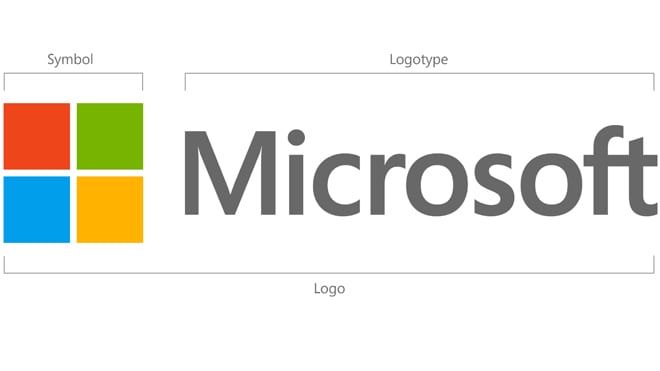
Assessing new logo design, such as the new one Microsoft unveiled to the world today, is akin to armchair quarterbacking. We can sit back, far from the fray, blissfully unaware of how many years of effort, practice and disagreement took place to reach the final result. Then we can should out random things like Throw the Ball! Count me as guilty of doing just that on more than one occasion.
When companies get a new look wrong in the eyes of the public, the fallout can be (surprisingly) dramatic. That’s what happened to GAP a few years back when it tried to refresh its logo. Many thought it was a joke. A virtual mutiny ensued. Eventually the company capitulated and reverted to the old one. Sure enough, customers, whether they know it or not, build strong affinity with brands.
I’m not a designer, or a student of typography, but as a marketing guy it’s always interesting — especially when, in this case, it’s a $250B tech giant — to try to figure out what the team set out to accomplish.
I thought I’d share some of my impressions of the new logo — the company’s first since 1987.
1. Product logo refresh telegraphs corporate direction
We’ve actually seen a glimpse of this new design language. Earlier this year Microsoft unveiled the Windows 8 logo. There’s a strong family resemblance if you compare the two. Usually companies start with a corporate identity and product brands within that umbrella assimilate the overall look and feel. In this case, the opposite happened.
2. Dark grey is trendy
Dark grey is the new black. Literally. Gone is the stark contrast of the old Microsoft logo with its ominous dark look. In with a softer, more approachable aesthetic. I’ve been noticing the use of dark grey across Android apps, web sites — in particular, it’s frequently used in place of pure black for backgrounds.

3. The world is flat (again)
You don’t need 3-D glasses to view this logo. It’s as flat as flat can be. Lines are angular. Shadow and lighting effects are no where to be found (thank goodness). And it’s consistent with the overall design metaphor of the upcoming Windows 8 operating system, which eschews fancy effects (“Aero”) in favor of a clean, simple user interface.
4. Color = a friendlier Microsoft
We’ve seen color on the Microsoft flag before on various logos for Windows, but never (as far as I know) for the corporate identity. In my estimation, that’s a deliberate choice to make Microsoft come across warmer, more fun. If anything, Microsoft has become boring, while Apple has become incredibly sexy. Adding color won’t reverse that any time soon (and unfortunately I’m suspecting the Surface tablet won’t either), of course, but it’s one small step in the right direction.
5. That sans-serif font
I like the new font. Gone is the fussiness of the italic styling, and the busy stroke detailing. This new Microsoft is as simple and clean as they come.
Grading the new Microsoft logo: A
