Porsche today announced a refresh of its iconic badge. If you enjoy analyzing and comparing the evolution of a design you might want to check out some of the photos Porsche released illustrating various changes showcased side-by-side.
Porsche says the crest has been in use on its cars since 1952 and that the last refresh took place in 2008, marking seven total iterations.
“The ’75 years of Porsche sports cars’ anniversary was the occasion for us to rework this trademark,” says Michael Mauer, Vice President Style Porsche. “With its cleaner and more state-of-the-art execution, the refined crest communicates the character of Porsche. We have reinterpreted historical characteristics and combined them with innovative design elements such as a honeycomb structure and brushed metal. The result is an aesthetically ambitious arc that bridges the history and the future of the brand.”
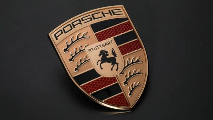
As for the changes, they’re subtle at first glance, but actually upon closer inspection several have been made:
- A “three-dimensional honeycomb structure” has been added to the horizontal red sections
- Refreshed crest animal — they look less prominent now
- The gold is now brushed with no background dithering — making the Porsche text stand out more
- “Stuttgart” also now more visible thanks to the font now being black — so far as I can tell this is a first in the badge’s history, so perhaps its to more readily reinforce pedigree
“The time factor is very important in a maturing process such as this,” Joachim Paetzel, specialist for color and trim at Style Porsche, describes the iterative procedure of designing the crest. “A trademark is not designed ‘off the cuff’ within a few days. You have to go back to it again and again, sometimes at longer intervals. The second or third look can reveal to you things that you want to optimize, until it finally achieves a harmonious, natural effect. Only then can you say with satisfaction: ‘This is exactly how it has to be!'”
Porsche says the new design will “start on the vehicle side at the end of 2023.”
Previously, the trademark has been updated five times: 1954, 1963, 1973, 1994, and 2008. In the photo below you can see a chronological comparison of the 2023 version on the right with the five previous iterations.
Visual History of the Porsche Crest Comparison: 1954, 1963, 1973, 1994, 2008, 2023
![]()
In addition, the iconic German brand revealed a series of facts under the “Did you know …” section of its announcement, further helping to demystify some of the design elements in the crest.
For instance, the black and red colors and stylized deer antlers (which are less bold now) were taken from the traditional crest of Württemberg-Hohenzollern.
Thoughts on the 2023 Porsche Crest Refresh
![]()
![]()
Overall, a great job and successful result. You can still identify all the heritage elements of the Porsche brand, but I like the way the 2023 update modernizes the look.
Most notably, removing that black dot dithering effect and going with embossed gold really enhances the “PORSCHE” and antler sections.
Meanwhile the red honeycombs hints at sophistication and precision engineering.
With Stuttgart more visible there’s no mistaking the origin story.
Look ever so closely at the horse, and you might even spot some tiny changes there too.
Interesting how a series of relatively minor tweaks can conspire to refresh something so thoroughly, and yet still remain connected to its forebears.
For me, it’s a yes.