
No one would argue that touchscreens aren’t the way of the future. In most cases. They make user interfaces that much intuitive. Without the ability to tap, swipe, and pinch, iPads and iPhones would not nearly resemble the useful consumer products we’ve come to appreciate.
But when it comes to touch displays Tesla is apparently going all in.
At the Model 3 launch — what a sharp looking EV! — Elon Musk took the wraps off a prototype to much applause, whooping and hollering. And why not? It looks like the first electric car for the masses was a near reality. The price of $35,000 US? A near impossibility. That’s a lot of car, and performance, for the money. With early sales sky-rocketing (140,000+ deposits of $1,000 US), consumers appear to be giving the new car, which joins the Model S and Model X as its third all electric car, a collective thumbs up.
Look closely at the spartan interior of Tesla’s Model 3, however, and you notice a few mysterious and/or interesting absences:
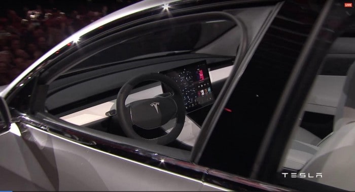
— there are no air vents
— there are no buttons to be seen on the dash anywhere, or the steering wheel
— there are no gauges or instrument clusters
Then again, as Elon Musk clearly pointed out, the three cars showcased at the Tesla design studio were merely prototypes. In fact, subtle differences (wheels aside) could even between be spotted among them. So, much can change between now and late 2017, and 2018 when the Model 3 hits mass production.
Many are saying based on discussions with Tesla staff that the dash is near complete, and that we’re seeing — a minimalist design featuring a 15-inch flat panel as our only source for information — will in fact closely resemble the end product. If so, I find the decision to forgo an instrument cluster odd. If the Tesla 3 is supposedly 5-star safety worthy shouldn’t it feature a distraction-free driving experience? Having to glance to the center console just to check on something as simple as speed seems counter-intuitive at best, border line insanity at worst.
Some argue that the center console design is similar to what Toyota has done with the Prius.
But there’s a significant difference.
On the Model 3 prototype the tablet-esque screen is mounted where a traditional center stack would go. It sits on the dash, roughly in between the steering wheel and glove box. On the other hand, the Prius screens, also in the center, sit about 12-inches forward, closer to the windshield. By placing the digital gauges further away from the driver, Toyota improves our ability to easily and safely read them, as they sit closer to our natural field of vision as we are scanning the road in front of us. The Tesla on the other hand — at least in the prototype as revealed in Hawthorne — would require us to take our eyes off the road, and look right, if ever so slightly, to pick up a basic piece of information.
Again, this is all based on a protoype. “Part 2” of the Model 3 launch could, and will likely, reveal more details about the car, especially the interior. It could very well be that Elon and team are planning on some sort of next-gen HUD. If he approached it in true Apple fashion… err, I mean Tesla fashion, we could expect to see a jaw-dropping windshield projection system that would elegantly complement the 15-inch flat screen. If that were the case, Tesla could still easily build right-hand drives of the Model 3 by merely flipping the steering wheel controls and projector — safety would still be intact because the HUD would fall into the driver’s field of view. A win-win to be sure; I certainly think this could be, along with the Model 3’s great range relative to the competition and low cost, a key differentiator.
And, keep in mind innovators like to push the envelope.
Often we initially feel uncomfortable with decisions that seem wrong at the time… like when Steve Jobs removed the CD-ROM drive from the debut, ground-breaking iMac (1998). Instead Jobs stubbornly insisted on something called USB. He would capitulate. And, of course, he was right. It hurt at first, but we were eventually thankful for the transition to something more convenient, faster, and easier to use. So too it could be Elon’s vision with a touch-based (and touch only) vehicle information system. By comparison, with the 2017 Prius, Toyota gives us a bit of both: a touch panel, but also conventional (tactile!) knobs and dials, such as ones for volume control and climate control.
More: Is Tesla CEO Elon Musk the new Steve Jobs?
Meanwhile, like any Silicon Valley company in beta or stealth mode, I suspect Tesla will continue to monitor forums and solicit as much feedback from customers and prospects as possible. After all, some of the best ideas likely come from the (very active) community. A prototype, while obviously far from complete, is an excellent device to stir up conversation, provoke reaction, and, ultimately, give Elon Musk an unassailable view into the needs of the market. Oh: it also generates pre-orders. Lots and lots of pre-orders. Well played.
