
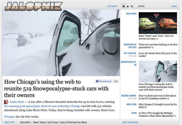
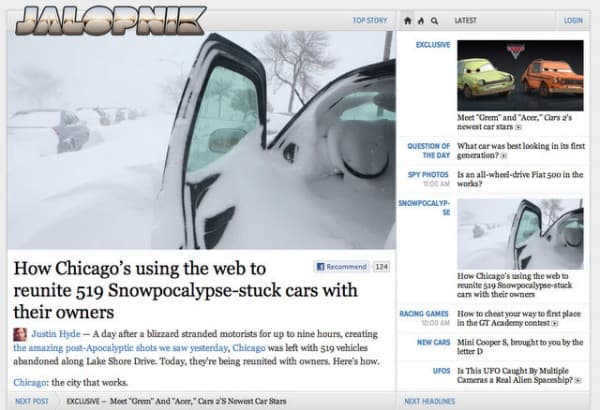
Gawker, a media company based out of New York, began rolling out a new template (“shiny new design”) across its network of blogs. So far the new look is available on Jalopnik, io9 and a few others; their flagship property Gizmodo is still in beta. This in itself would not normally be news worthy. But what makes this particularly interesting, especially for those of us that like to follow new media, is that the new look features only a single lead story. Yes, that would be just one post. Uno. When you land on the new page you’re greeted with just that one lead story. To the right is a scrollable list of recent posts which replaces the traditional one column stream of blog posts.
The new look is certainly slick, quite beautiful really; and one that would play well on tablets, as others have suggested. In fact it looks almost like an app. Notably absent are the standard splash of ads found on most blogs.
It’s a bold, unexpected (users knew the change was coming but were not expecting this dramatic a makeover) and risky move.
Beyond the Blog?
Nick Denton, the founder of Gawker, wrote a manifesto explaining the rational for the new design direction.
“The internet, television and magazines are merging; and the optimal strategy will assemble the best from each medium,” he writes.
Minimalism and aesthetics are the new order of the day — two concepts not normally associated with the blogosphere. Is there a Steve Jobs-like design influence here? Save for the Facebook “recommend” button, social sharing has also been eliminated, further reducing clutter. “These sites festooned with social media buttons—they look like primitive tribesmen clutching pathetically onto shiny baubles they believe to the symbols of modernity.”
On the scoop, the visual, and the long-term
Denton cites the “power of the scoop” in reference to the death of the snarky “remix” model of blogs of yore — ironically, the very style of which Gawker was born.
Another of the seven reasons he spells out include the notion that the web is a visual medium. Very true, and with the advent of tablets I’d suggest this will only grow in importance.
In terms of differentiation, though, and building a blog to stand the competitive test of time, he points to two key elements: video and long-form posts.
Will the new look fly?
So far reactions have been mixed to quite negative. Who moved my cheese?!
MAIN GRIPE: New site does not let users browse easily. Browsing (with big thumbnails) should be front-and-center, not the individual stories.
I pine for the old article queue with images. Today, when loading Jalopnik (new), the reader gets hit in the face with one big image: a Jetta advertisement. It’s pretty obvious what the redesign is geared to do, and that’s to pay the bills. I guess it had to happen.
I like the new look, visually, but i do think that Gawker might be disappointed in total page views. The bulk of the content is half hidden on the right.
You went from a straightforward, easy to read site with clear and concise content flow and user feedback to the equivalent of a concept car: visually stunning to look at but completely impractical for everyday use.
Those who don’t like the new look can switch back to “classic” although there’s always the chance they won’t know how or care to take the time, and just simply bounce off the site.
I’m wagering many are watching the experiment unfold. It’s the most dramatic makeover by any major network of blogs that I can recall; namely because the metaphor of the scrollable chronological, long-form home page with thumbnails is killed off for something completely new.