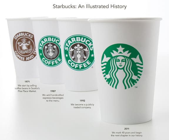
Starbucks today took the wraps off its new minimalist, 40th anniversary logo. In keeping with the increasingly visual world, gone are all the words.
The mermaid “siren” instead is slightly enlarged and is now the sole representation of the Starbucks brand. Note that her hair is strategically positioned to ensure its a family friendly affair. But whether the new look is really new or not could be a matter of much debate. Your interest level may vary.
On the corporate site, Starkbucks president and CEO Howard S., Starbucks chairman, explains the thinking behind the update, “Throughout the last four decades, the Siren has been there through it all. And now, we’ve given her a small but meaningful update to ensure that the Starbucks brand continues to embrace our heritage in ways that are true to our core values and that also ensure we remain relevant and poised for future growth.”
In a separate post, Starkbucks explains the origin of the iconic siren, “In a search for a way to capture the seafaring history of coffee and Seattle’s strong seaport roots, there was a lot of poring over old marine books going on. Suddenly, there she was: a 16th century Norse woodcut of a twin-tailed mermaid, or Siren.”
So there you have it. Starbucks has a new logo. But GAP does not.