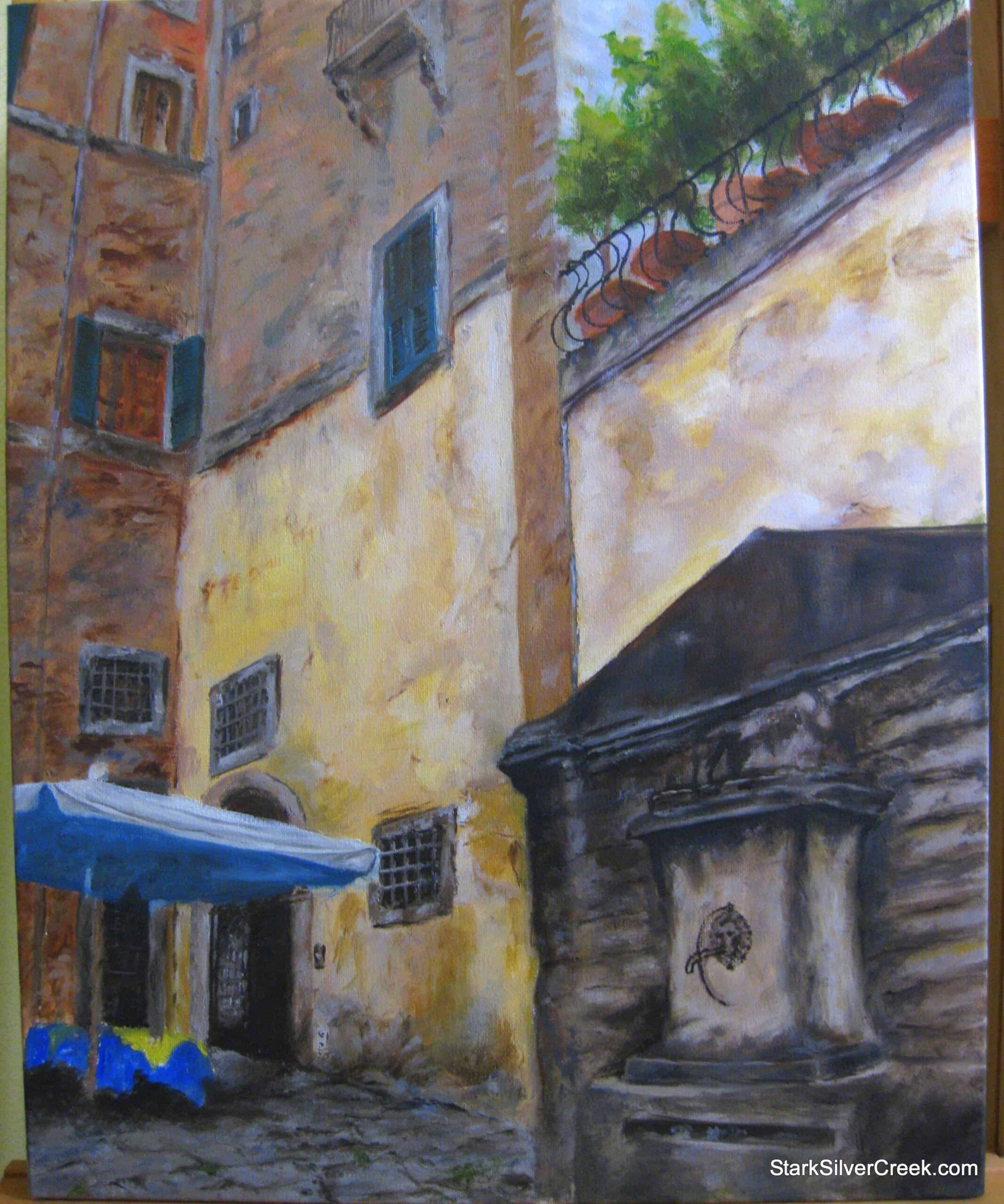

In class this past week, I finally moved onto my second pass of the foreground which includes the fountain and the dining area in bright blue. Up until now, these areas were just blocked in as part of the first pass to cover the entire canvas with paint.
I am having some difficulty getting the correct tones for the fountain. It does dominate the foreground so I really need to make sure it makes a statement without becoming overpowering. The trouble is the colors look different under varying light sources. It ranges from black to dark brown tones.
Clint walked past it one evening and noted it looked like the fountain would open up and the Batmobile would drive out from it. That wouldn’t be so bad as I’ve always had a soft spot for Batman. However, in a painting that is supposed to be situated in Rome, perhaps it would seem out of place.
After a couple of days pondering the issue, I finally came to the foreboding conclusion that I will need to rework the fountain so it has lighter and warmer tones of color.
On a brighter note, I am happy with how the white and blue umbrella is progressing.
