
Peloton is routinely rolling out software updates. Though you get a notice on the Bike when they are installed there’s no way of knowing (that I know of at least) of what’s new. Unless, of course, there’s a major new feature in which case the Peloton team does write about it on their blog.
Last week a new software update landed, and is always the case I tried to see if I could spot any changes. You know. The sorts of kind of crazy things you do during a Pandemic when you’re cycling and going nowhere. So I spotted three changes in the user interface on the bike. Again, all very minor. But since I discovered them I couldn’t but help myself and share them here on Stark Insider.
3 Peloton User Interface Updates / September 2020
Note: these are possibly the worst photos you’ll ever see of the Peloton UI. Sorry in advance. It deserves much better as the interface is very… well, it’s very Tesla-like and extremely well thought it — eschewing a video game-centric philosophy in favor of a classy and clean and modern layout. It’s just that I haven’t figured out a way to cycle at the same time and land a good shot with my iPhone without it being out-of-focus and junk. Next time I may need the help of pro Loni Stark.
1. Workout Segments are Now Labeled with Text
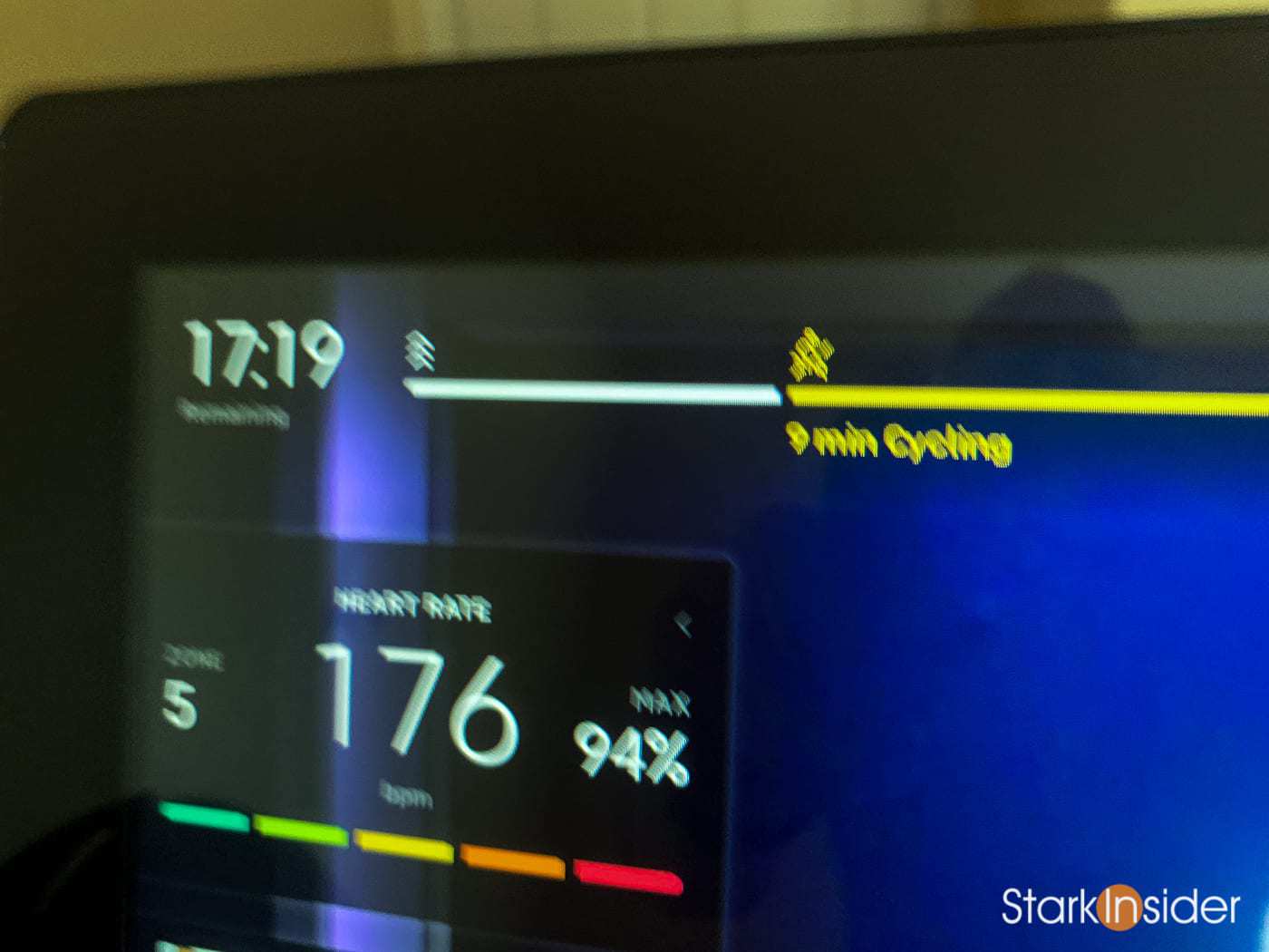
The informative timeline at the top of the display has become even more… informative. Not only can you see the type of activity during any activity based on the icon floating atop the segments, you can now see it explicitly stated just below. For example, in above (ridiculously bad) photo you can see it clear as mud: “9 min Cycling”. I quite like this enhancement as now at a glance you can easily see how any given ride is programmed without having to guess the various segment lengths.
2. Dynamic Cadence and Resistance Markers
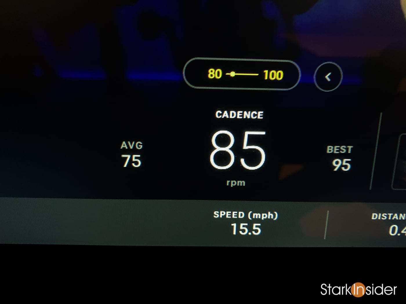
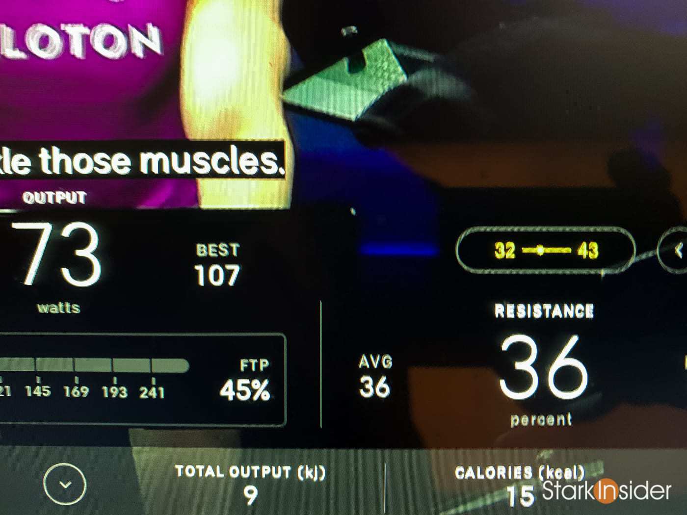
Before this update, the Peloton bike interface would display target cadence and resistance ranges above each number on the lower part of the screen. These of course would change depending on the instructor’s call outs. That hasn’t changed. But now there’s a marker that slides dynamically depending on your cadence or resistance within the target zone. Again, above photos show the new feature. It’s kind of neat, and I suspect this was rolled out in tandem with the new Bike+ which features an auto-resistance feature. However, I do have one nit here. For resistance things are fine, as for any interval you set it and leave as is, say, for 20-, 30-seconds or however long required (in the example above it’s set at 36). But on the cadence side this little yellow marker moves a lot — especially if you’re at a low cadence out of the saddle when it’s difficult to keep your legs moving smoothly. Back and forth that little yellow market goes. So it’s a bit distracting as it draws your eye’s attention there continuously. It’s sort of like a car with one of those wildly swinging MPG live gauges that doesn’t sit still. You accelerate it goes to 0. You brake and it goes to 100+ MPG. Not the most helpful thing in most situations. I think Peloton can fix this by averaging out the smoothing timing so it’s not updating so quickly.
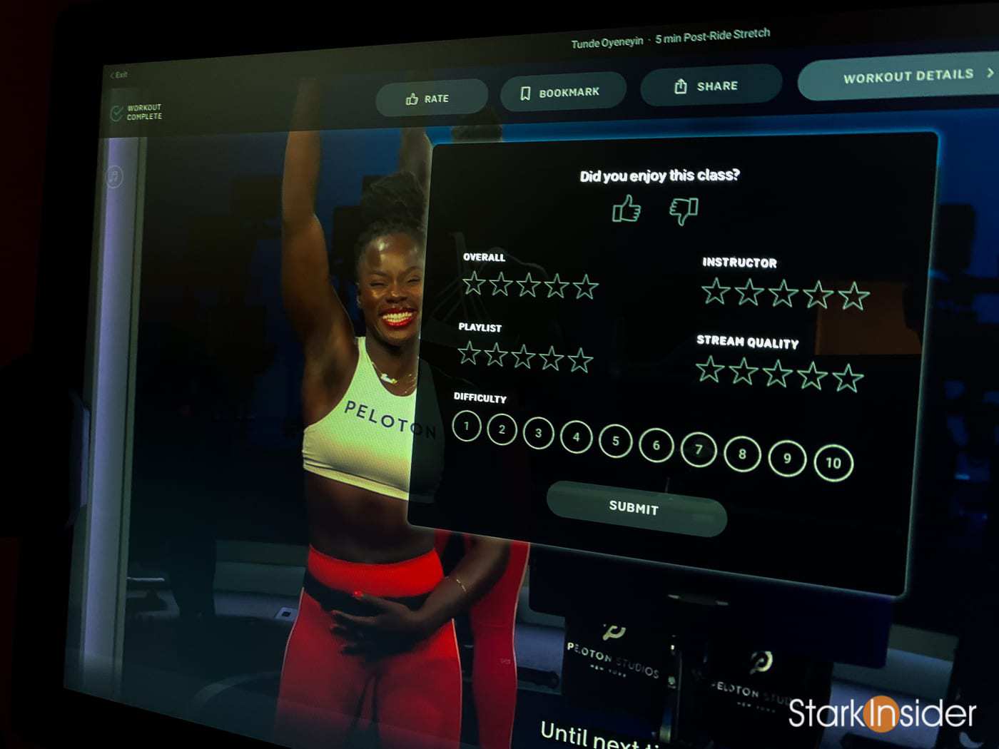
3. Post-Ride Review is Now Optional and Features a Well Designed Bar with Buttons
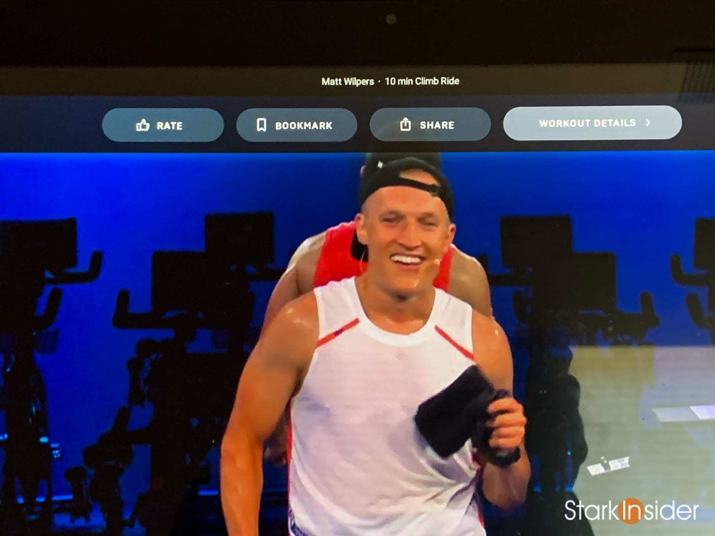
This is much appreciated. With the new software update post-ride reviews are no longer mandatory and no longer pop-up automatically — usually on top of the instructor’s face. Instead there’s an elegant bar at top with choices: rate, bookmark, share (Facebook, Fitbit, Strava) and workout details. I always do a review anyways, but I prefer being able to finish the complete ride, enjoy the brief last minute stretches before putting down my water and tapping in a quick review. For those that don’t own a Peloton bike, a review is straight forward. Thumbs up or thumbs down. And a 1-5 star rating for four categories: Overall, Instructor, Playlist, and Stream Quality (always been flawless for me). In addition you can let Peloton know how difficult you thought the class was (1-10) and most of the time there’s also an option to rate the accuracy of the target metrics for cadence and resistance (1-10).
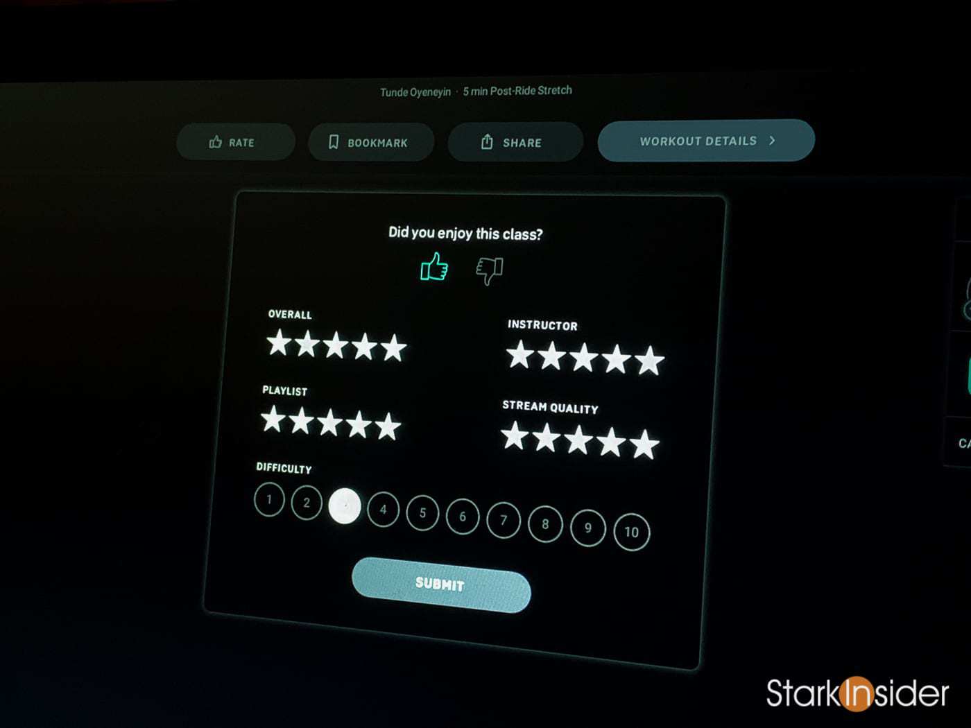
In any case I seldom give less than perfect scores across the board. Maybe I’m soft. Maybe I’m Canadian. Or maybe it’s that the rides and instructors are almost always uniformly superb. Earlier this year when COVID-19 first struck and then later during BLM you could certainly see and feel the emotion in many of the instructors. I like that — these aren’t corporate training classes and the human element is a key ingredient when it comes to connection and motivation, especially when we’re engaging more often virtually.
ALSO SEE: Peloton Top 10: Best accessories for your bike
In any case just some thoughts on the three new UI tweaks I noticed. There’s likely (many) more I have yet to discover. I’ve owned the bike since March, and am constantly impressed by the quality of the programming, the instructors, and, best of all, how it’s improved my fitness level and help me drop some pandemic weight. In fact I’m now in far better shape than I was when I used to trudge to the gym 3-4 times a week. Never again. At least this part of the New Normal is welcome.
