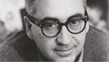
If you enjoy the art that is movie title sequences then you likely already know Saul Bass.
Before Bass, title sequences — credits that typically appear before a movie begins — were generally rote and simply relayed information about names of various people involved in the projects. Things like the actors, assistants, lighting and costume crew, the director, etc. Bass took all that and mashed it up into flamboyant and artistic presentations, the best of which would immerse the audience and create excitement for what was about to follow.
WATCH: Vertigo Title Sequence by Saul Bass
In the 1950s and 1960s he turned those brief minutes into art.
Some of the most famous title sequences designed by Bass include films such as:
- Vertigo (1955)
- The Man With The Golden Arm (1955)
- Psycho (1960)
- Spartacus (1960)
- Grand Prix (1966)
- Goodfellas (1995)
It’s hard not to imagine that many of the early James Bond (with Sean Connery) title sequences were heavily influenced by Saul’s modern, geometric style. Dr. No (1962) by Maurice Binder is but one striking example:
WATCH: Dr. No Title Sequence by Maurice Binder
The New York born artist (he died in 1996) was also the creative genius behind some of the world’s most memorable and iconic logos including AT&T and United Way.
Who doesn’t instantly recognize this logo, originally designed by Bass in the 1980s…?
![]()
Artsy posted a nice write-up on Saul Bass that’s worth checking out; especially if you’re interested in graphic design and the aforementioned title sequences.
 Too bad his legacy hasn’t quite risen as much as I believe it should have. In time I think that will change. Take a look at the openings of most of today’s movies and there’s inevitably a Saul Bass cue or two, if not at least a wink and a nod to the trailblazing graphic designer.