It’s all about bold purples, and oranges. With a hint of some primaries too, like splashes of yellow and red in the name of vibrancy.
Not just Instagram’s pretty new icon (see above), but also as I’m seeing the trend across culture in general. In 2016, it would seem one key element of design, along with flatness (i.e. material design) and the elimination of skeuomorphism (e.g. the vintage camera used for the old Instagram icon), is the predominant use of striking color.
We may say an icon is just an icon. Nothing more, nothing less. Yet it reflects the creative output of a small team, one that has no doubt tapped into various channels, sources to determine what is “sticking” with us consumers when it comes to response to certain design elements.
I’ve noticed the trend to bolder color palettes across other mediums too.
We’re seeing bolder set designs across stages here in the San Francisco Bay Area.
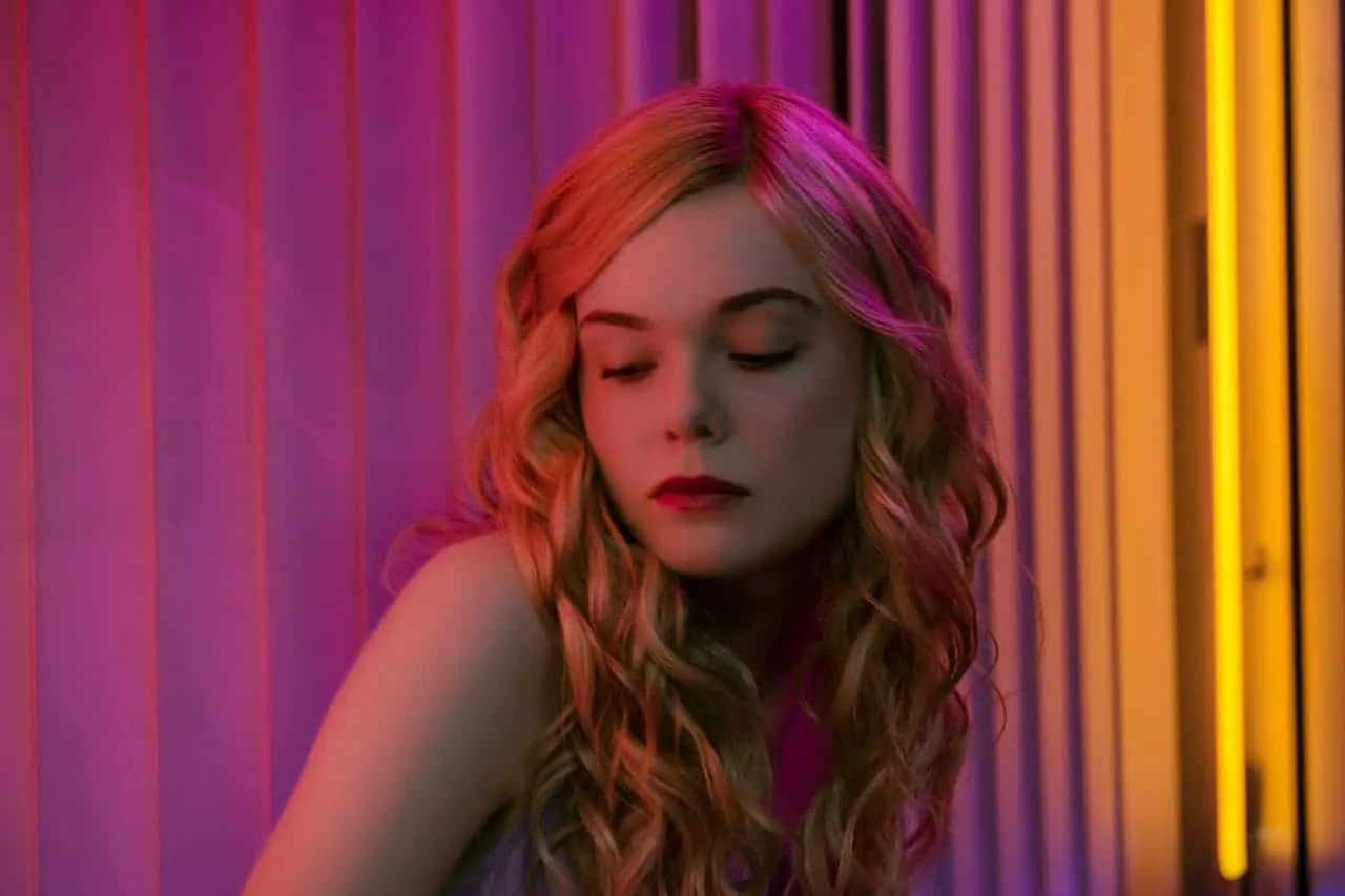
Film, especially independently produced ones, are seemingly eschewing muted, drab color grades in favor of ones heavy in contrast and saturation — and, again, like the new Instagram icon, especially emphasizing secondary colors residing between yellow and red (oranges), and red and blue (purples), but less so between blue and yellow (greens). Danish director Nicolas Winding Refn is a good example of that. His surreal Bangkok drama Only God Forgives was awash in purple and orange and red. So too his new film project, The Neon Demon, premiering this week at Cannes.
I wanted to know if it was just me, or if indeed vivid colors was really a thing for 2016.
A quick Google revealed some interesting finds that seems to corroborate the trend, and suggest that Instagram is in tune:
- Apparently, lilacs and purples are popular interior design colors, that can make a room “both elegant and engaging.”
- Behr (Home Depot) also believes that pops of color, and contrasts are key color trends this year
- How about hair color? “Cinammon swirl” along with ecaille and buttery is a favorite
- And, again, purple, purple, purple
- On the architectural front, it seems white and lots of light/windows never go out of style, but “Bold Blues” is one top pick
One strong counterpoint comes from Benjamin Moore who named “Simply White” as their “color” of the year. Hmmm. And: boo!
Anecdotal to be sure, but it is interesting to try to follow the overall philosophy towards color and design, especially when looking for common threads and trends across industries. Maybe, it’s a reflection of people’s overall sentiment? The economy? Life in general? Or that we must look for inspiration outside of the ordinary, to escape everyday doom and gloom? Perhaps. I really don’t know. Like when hi-fi stereo components oscillate between black and silver, or when jeans go from flooded to tight, or when we favor woods over metals, and then metals again, or when we prefer ketchup over mustard, before once again reaching for Heinz. Who knows, it’s certainly fickle, and I think definitely impossible to predict.
Personally, I’ve made it a goal to improve my color correction and grading skills when it comes to editing videos. For almost as long as Stark Insider has existed (10 years), I’ve been producing videos for this site. But, man, I’m definitely what they refer to as “Chroma-Illiterate.” Lately, though, I’ve endeavored to get a handle on white balance. And to better finish the overall look of my videos. It’s been an interesting process so far. Now every time I see a photo or video on Facebook or Twitter or, of course, Instagram, I see it in an entirely new way. Is it natural? Has a designer given it an intentional look to heighten reaction? Is it properly balanced and graded?
So Instagram has a new icon. But scratch the surface of the design choices that the team made in creating it, and you might discover a whole other (eye-catching) world.