Sometimes a feature sneaks up on you.
I never expected something like the ability to have “transparent system bars” to be a big deal. That all changed, after spending a few weeks with my new go-to Android Twitter app, Talon.
Aesthetically it’s a beauty. Slick, with a modern interface. I particularly like the grey tones, and orange highlights (links, user names, hashtags). Talon is also a speed demon. And it’s only $1.99 (Google Play Store), not too shabby in the world of Twitter apps.
Talon is the first app I’ve noticed that uses the Android 4.4 transparent status bars feature.
I kept wondering: Why does the Talon app look so darn good on my Nexus 5?
It wasn’t that others–notably Falcon Pro, and the native Android Twitter app–were not necessarily up to par. Those too are decent. But there was something about Talon that felt “big screen” or, and this I know will sound silly, “cinematic.”
Transparent System Bars – If not a killer feature, at least handy
After spending a few minutes early one morning navigating Talon’s extensive (and I mean extensive) sea of options and settings I came across something called: “UI Extras.” One of the features that setting activates when checked are “Transparent System Bars.” It only works in 4.4 (KitKat).
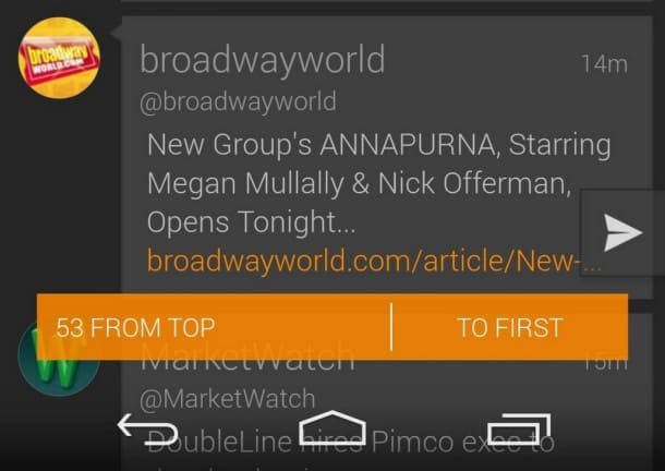
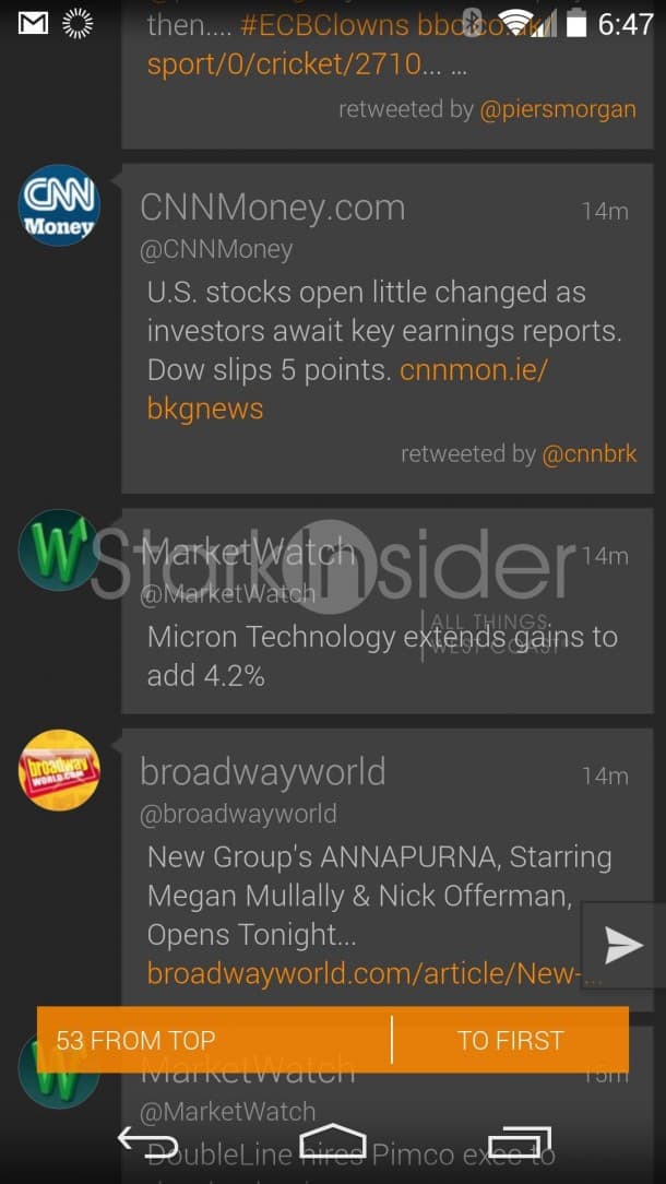
Activating Transparent System Bars does exactly that. It allows the app to display information over both the status bar at the top and the soft navigation controls (back, home, apps) at the bottom:

That might not sound like a big deal. But in day-to-day operation it smartly solves one of the long-standing criticisms of phones that use on-screen buttons (like the Nexus 5 and 2014 HTC One), instead of physical buttons (Samsung Galaxy S5). By leveraging transparency, the app can use the extra screen real estate otherwise wasted with status information. And nothing is lost. I can still read the time in the top, see battery status, incoming notifications, and I can still hit any of the three Android nav buttons.
Talon is the first app I’ve noticed that uses this transparent status bars feature in Android 4.4. I’m certain there’s many others out there, but I’ve yet to run across any. As far as I can tell, the Facebook app doesn’t use it (and could benefit from the extra screen space). Neither does Gmail, Maps or any other stock Android app. I expect that will change once users get accustomed to the benefits.
It’s all about Spit & Polish
Transparent System Bars, then. Not exactly earth-shattering stuff granted. Just one guy’s minute observation in a world full of big ideas. Sometimes, though, it’s the little things. And that nifty little KitKat feature along with other tiny ones like Toasts (floating statuses) and major ones like Google Now, remind my why Google continues to do such an impressive job with Android.


