The march of the flat logos continues. Gone are the bevels. So are the oh-so-90’s shadows. And textures? That’s for Microsoft Paint. It seems like just about every tech company in existence has got the memo: get rid of all the fuss, logos shall be clean, flat. Well, unless of course, your Yahoo.
So far it looks as if 2013 in tech will go down as the year of the logo and color
With its Bing search engine, Microsoft has adhered to the mandate. The new Bing logo, revealed today (but not yet live on bing.com UPDATE: click here for a preview of the new Bing), is about as flat and basic as it gets. As we’re accustomed to seeing more frequently the font is sans-serif (Segoe) in yellow, with plenty of kerning to let give the letters ample room to breathe.
To the left is a weird shaped thing. If it were made of metal it might be a piece of modern art. Instead it looks as if a designer was just playing around in Adobe Illustrator and decided to go with the random expression–why not, it worked for Picasso.
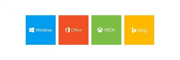
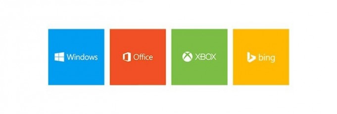
The new look, however, does bring the Bing logo in line with the rest of Microsoft’s recent re-branding efforts. New logos for Windows, Office and XBOX all feature a monochromatic, flat aesthetic, each with its own family color: blue, red and green respectively.
I didn’t have any objections to the old Bing logo. Actually, I thought it was quite nice. And the Bing services, and especially the Bing apps on Windows 8, are also really impressive. Now that I see it in concert with the rest of the Microsoft family, the new look makes sense:

Word on the street is Google has some new flat logo mock-ups making the rounds internally to replace it official corporate logo. I wouldn’t be surprised if we see it this year. A lot of Google’s design in its apps and web services have a simple, white-space inspired design that eschews shadows, textures and bevels. It’s a clean, modern look that emphasizes functionality and ease of use.
So far it looks as if 2013 in tech will go down as the year of the logo and color (“A Colorful Year for Mobile“).
Apple has famously succumbed and now offers the iPhone in an assortment of colors (but, Gold?!). Google’s Motorola division launched the well-received Moto X. Made in the U.S.A., the Android smartphone can be customized extensively. Marissa Mayer has been doing good things over at Yahoo. The stock has doubled since she took the helm. But the company’s new logo has received mix reviews. In the end, though, I think most would pick shareholder value over Helvetica goodness.


